
Role: Art Direction & Visual Design Lead
Context
First Abu Dhabi Bank was launching the FAB Rewards Indulge Card — a premium product meant to compete on lifestyle and exclusivity, not just financial terms. The challenge wasn’t just “make it look premium” — it was making a card feel like it belonged to a specific, aspirational way of life, while staying inside Mastercard’s global brand system.
First Abu Dhabi Bank was launching the FAB Rewards Indulge Card — a premium product meant to compete on lifestyle and exclusivity, not just financial terms. The challenge wasn’t just “make it look premium” — it was making a card feel like it belonged to a specific, aspirational way of life, while staying inside Mastercard’s global brand system.
The Insight
Premium positioning in card design often defaults to generic cues — gold accents, minimal type, dark backgrounds. That reads as “expensive,” but not necessarily as belonging to the customer’s actual world. For a Dubai-based product, the strategic question became: what makes exclusivity feel local and specific, rather than generic luxury language?
Premium positioning in card design often defaults to generic cues — gold accents, minimal type, dark backgrounds. That reads as “expensive,” but not necessarily as belonging to the customer’s actual world. For a Dubai-based product, the strategic question became: what makes exclusivity feel local and specific, rather than generic luxury language?
The Direction
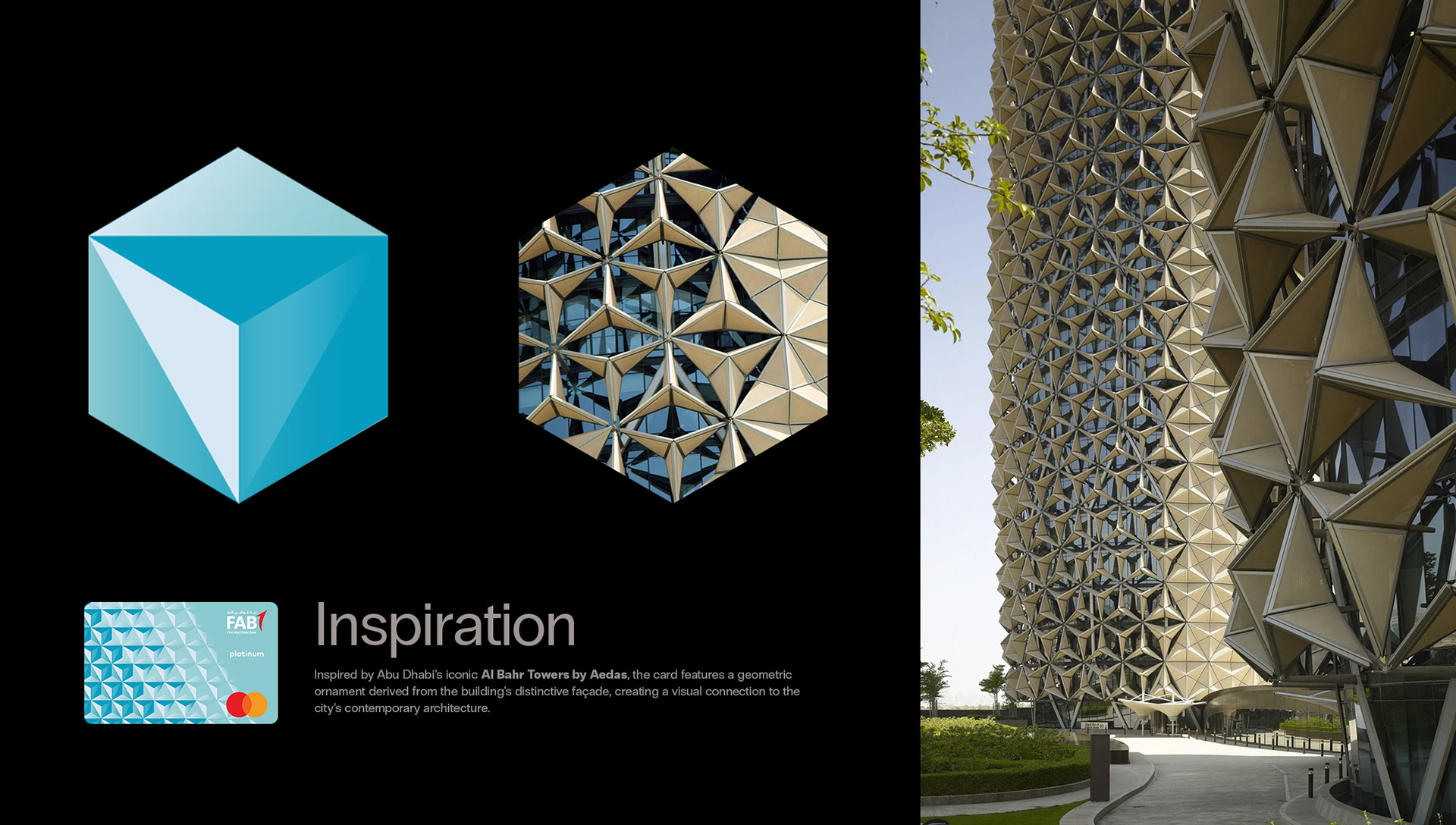
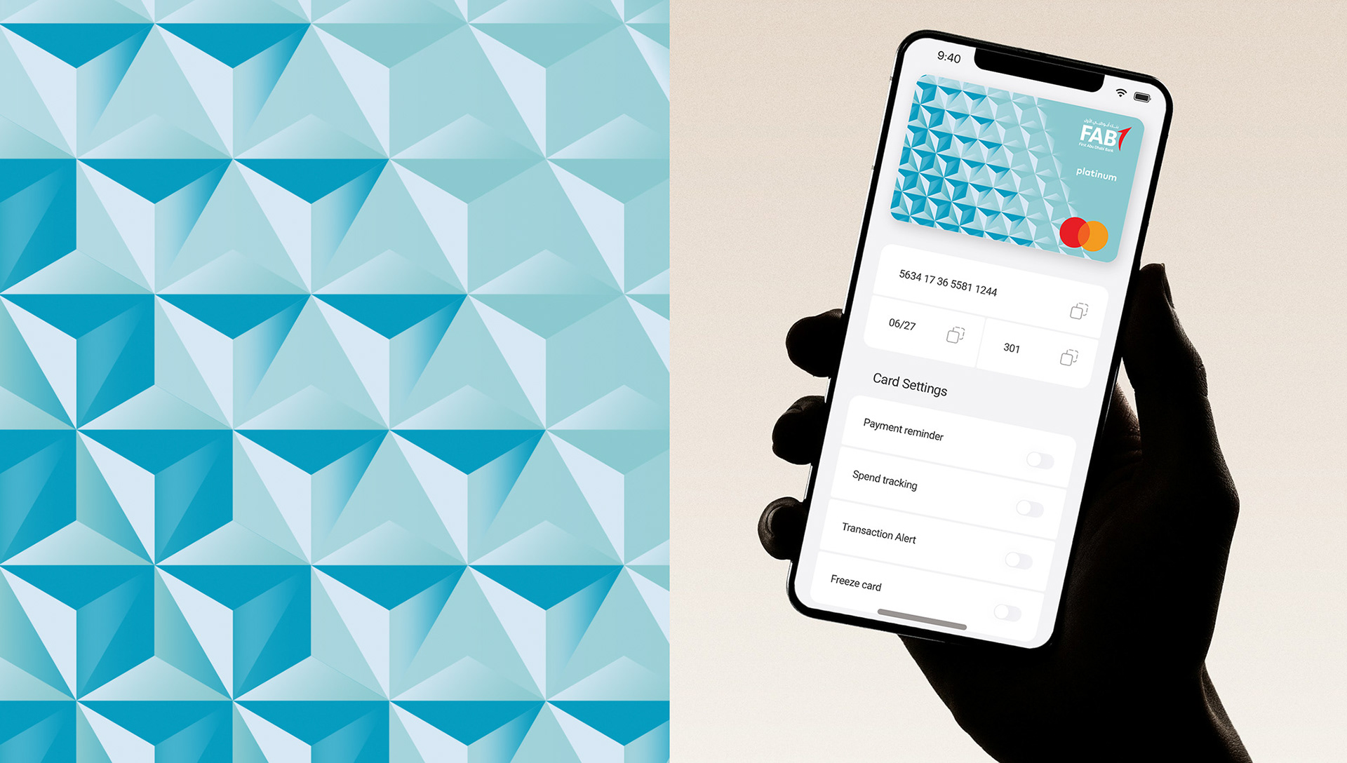
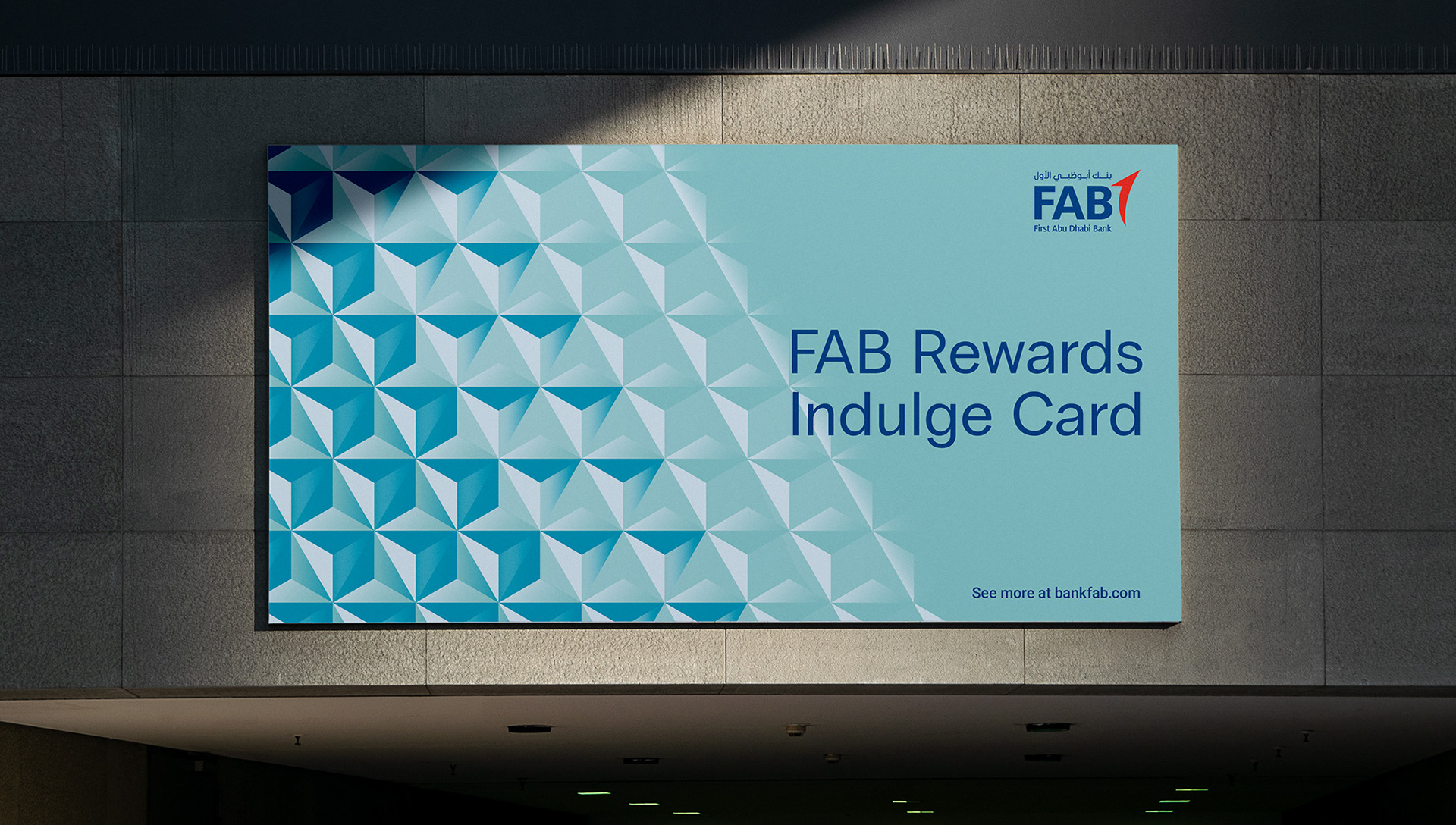
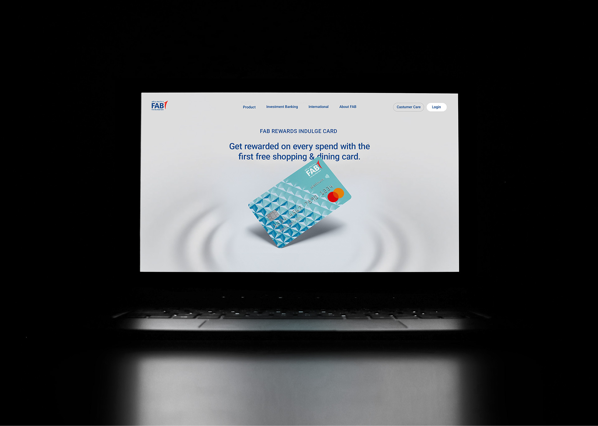
The answer was to root the visual identity in something distinctly Dubai — its architecture. I developed a custom pattern based on one of the city’s iconic buildings, turning a recognizable piece of the city’s identity into the card’s core visual signature. This gave the design a point of view: premium not because of abstract luxury cues, but because it reflected something the target customer would actually recognize and feel proud of.
The answer was to root the visual identity in something distinctly Dubai — its architecture. I developed a custom pattern based on one of the city’s iconic buildings, turning a recognizable piece of the city’s identity into the card’s core visual signature. This gave the design a point of view: premium not because of abstract luxury cues, but because it reflected something the target customer would actually recognize and feel proud of.
Execution
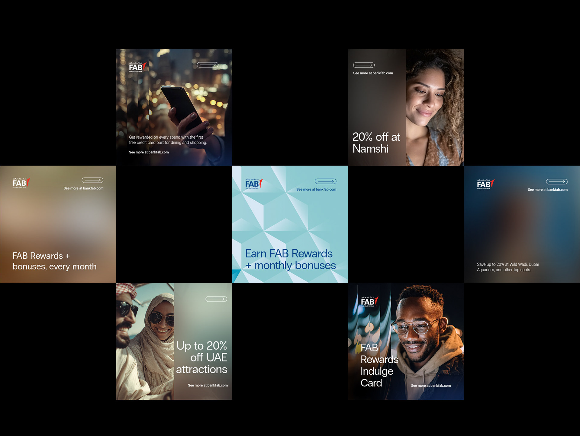
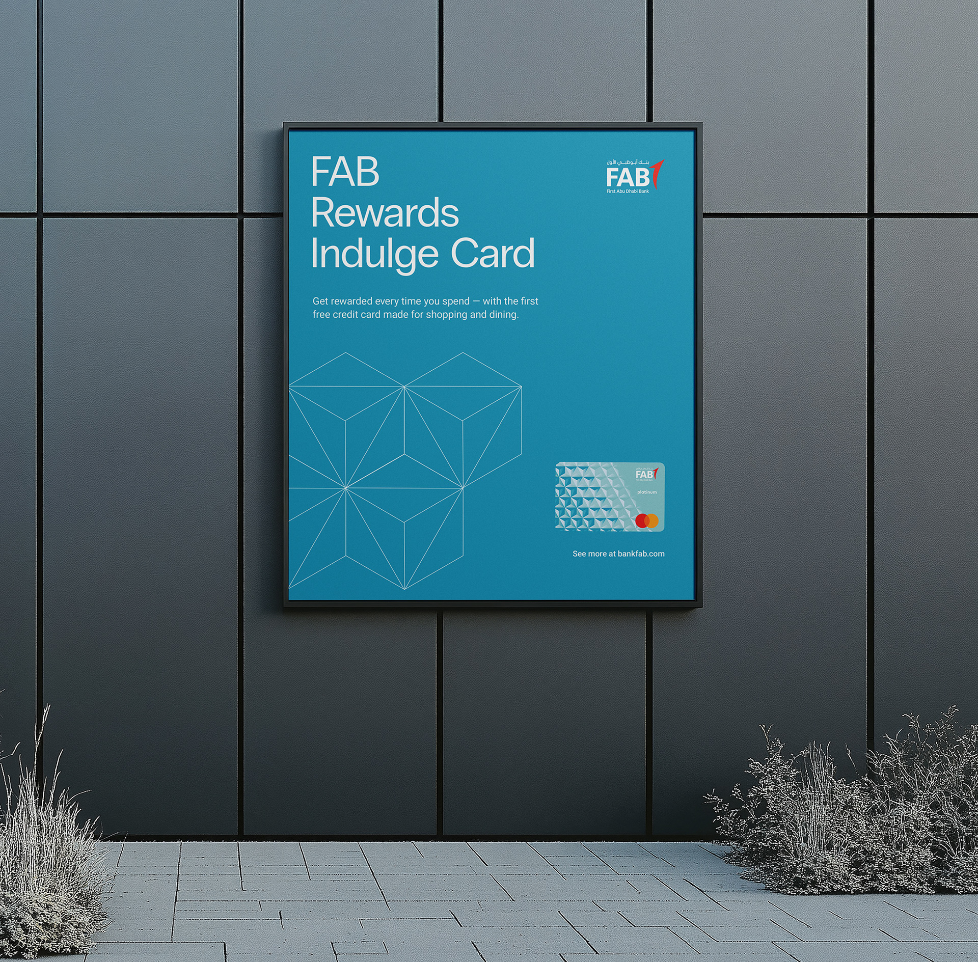
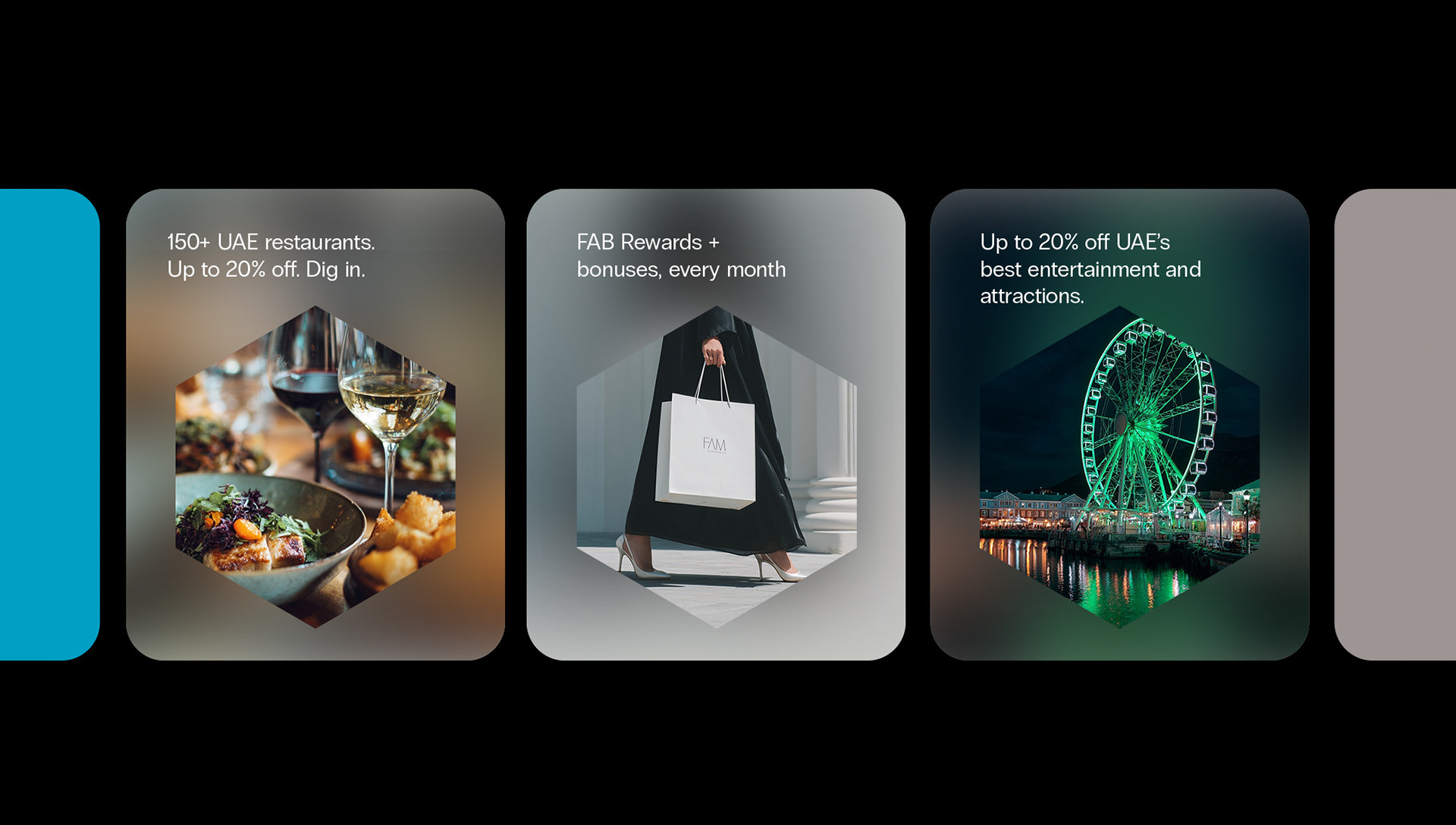
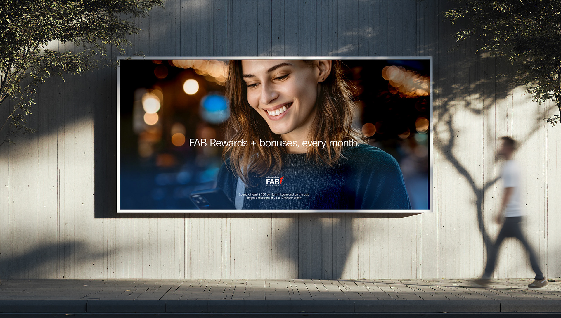
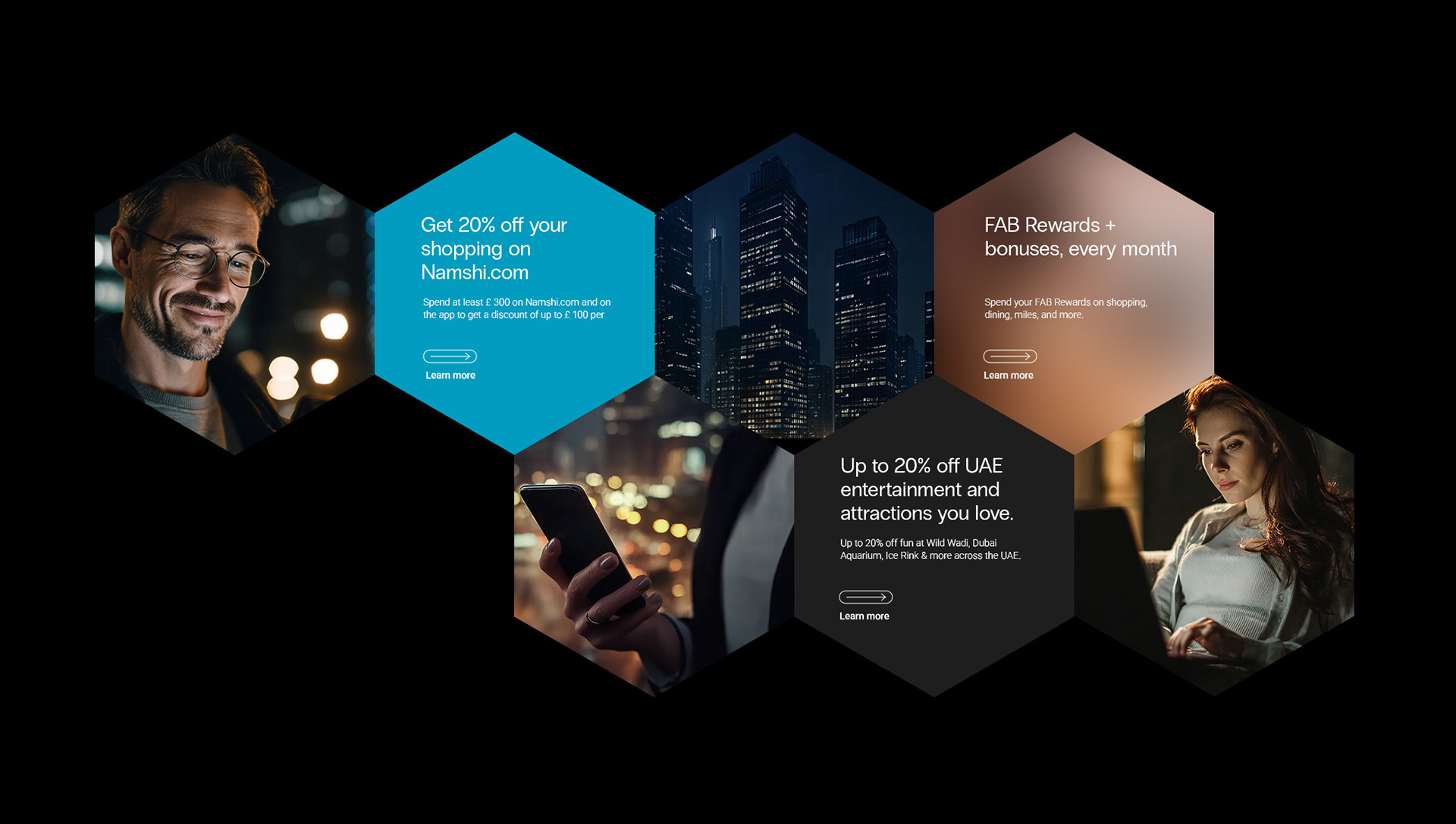
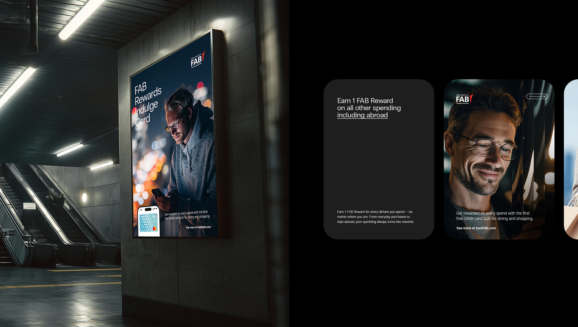
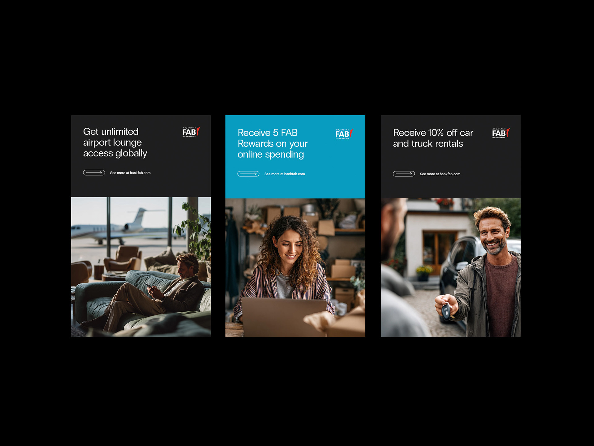
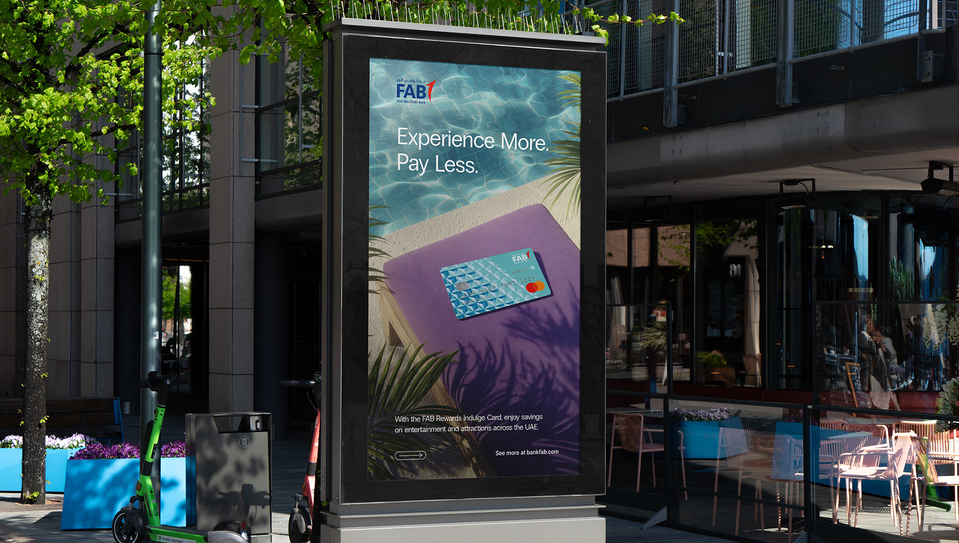
From that single pattern, I led the visual direction and built out a full system — key campaign assets, digital banners, posters, and in-store materials — all built to stay consistent with Mastercard’s brand guidelines while carrying that distinct, local point of view across every touchpoint.
Outcome
The result was a cohesive, recognizable visual system that reinforced the card’s premium positioning without relying on generic luxury tropes — strengthening both brand consistency and the card’s perceived exclusivity across physical and digital channels.
The result was a cohesive, recognizable visual system that reinforced the card’s premium positioning without relying on generic luxury tropes — strengthening both brand consistency and the card’s perceived exclusivity across physical and digital channels.
This project presentation is created for non-commercial use. All materials used in the project belong to their respective owners and are taken from official websites.