Role: Lead Brand Designer & Visual Strategy
Context
Fluent needed a fintech identity in a neobank market saturated with two failed extremes — either overly corporate (which reads as cold and impersonal) or visually generic (which fails to build any real trust). The brand needed to simplify complex financial interactions for a digital-first audience, with the identity and the in-app experience feeling like one seamless thing, not two disconnected layers.
Fluent needed a fintech identity in a neobank market saturated with two failed extremes — either overly corporate (which reads as cold and impersonal) or visually generic (which fails to build any real trust). The brand needed to simplify complex financial interactions for a digital-first audience, with the identity and the in-app experience feeling like one seamless thing, not two disconnected layers.
The Insight
In fintech, trust isn’t built through visual polish alone — it’s built through clarity. Most neobanks either over-design (adding visual noise that makes finance feel more complicated) or under-design (stripping away personality until nothing feels human). The strategic question was: how do you make a financial product feel simple and human, without sacrificing the credibility people need to trust it with their money?
In fintech, trust isn’t built through visual polish alone — it’s built through clarity. Most neobanks either over-design (adding visual noise that makes finance feel more complicated) or under-design (stripping away personality until nothing feels human). The strategic question was: how do you make a financial product feel simple and human, without sacrificing the credibility people need to trust it with their money?
The Direction
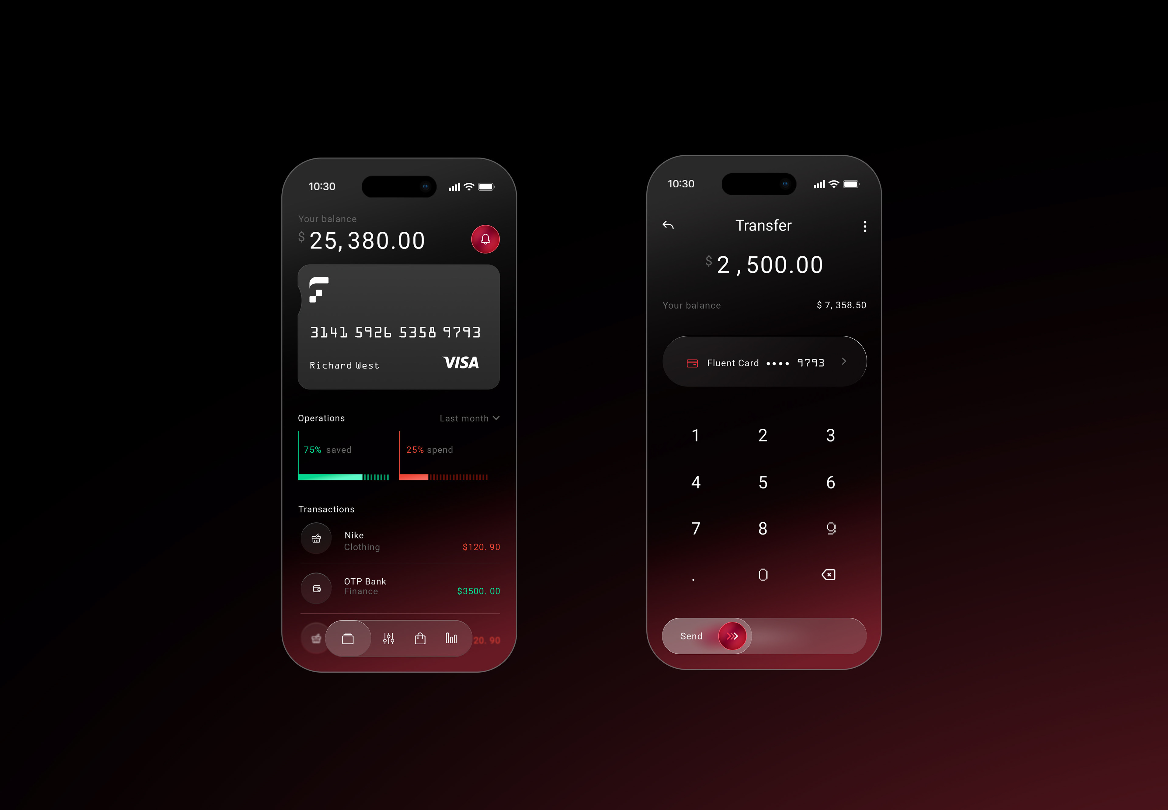
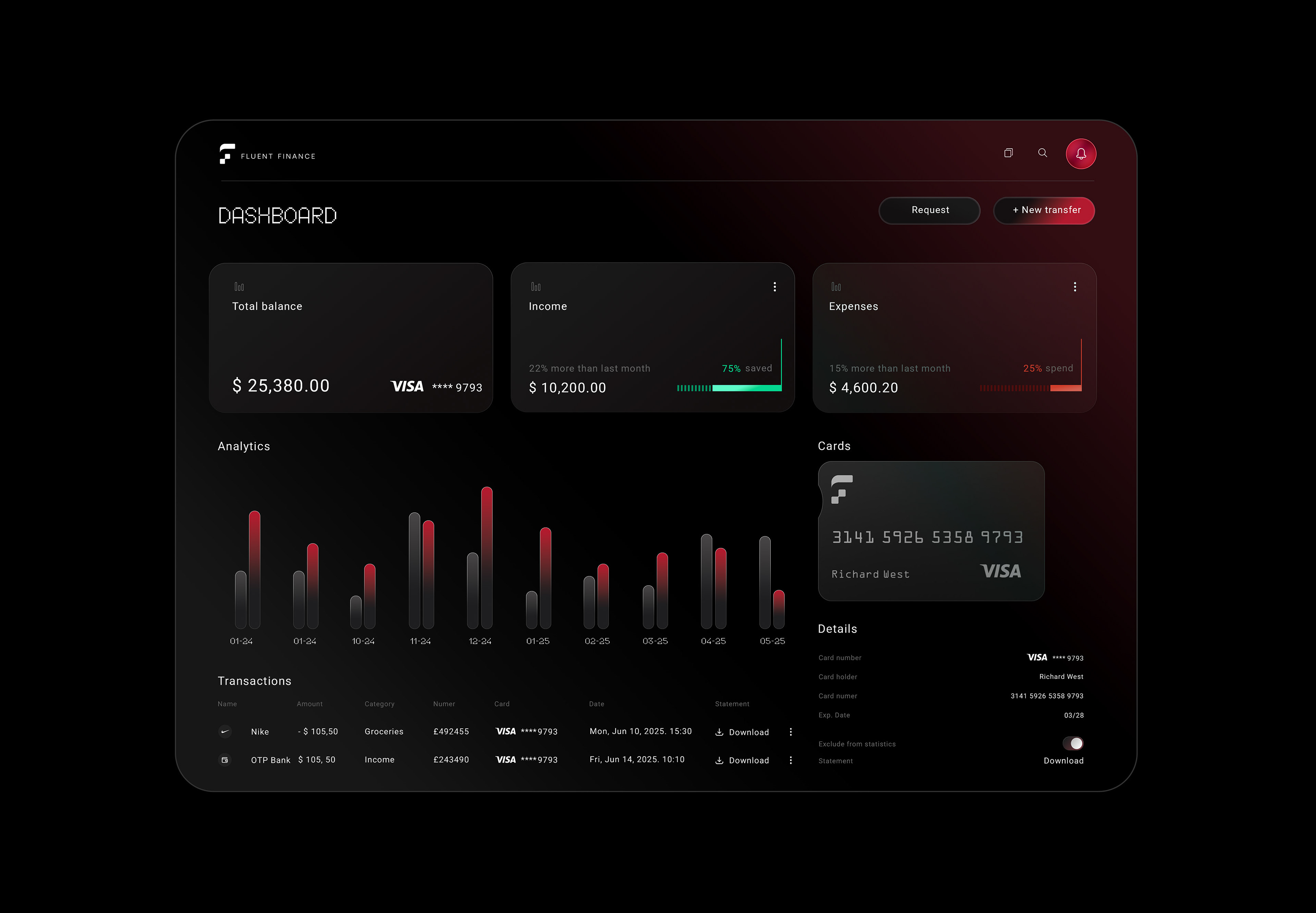
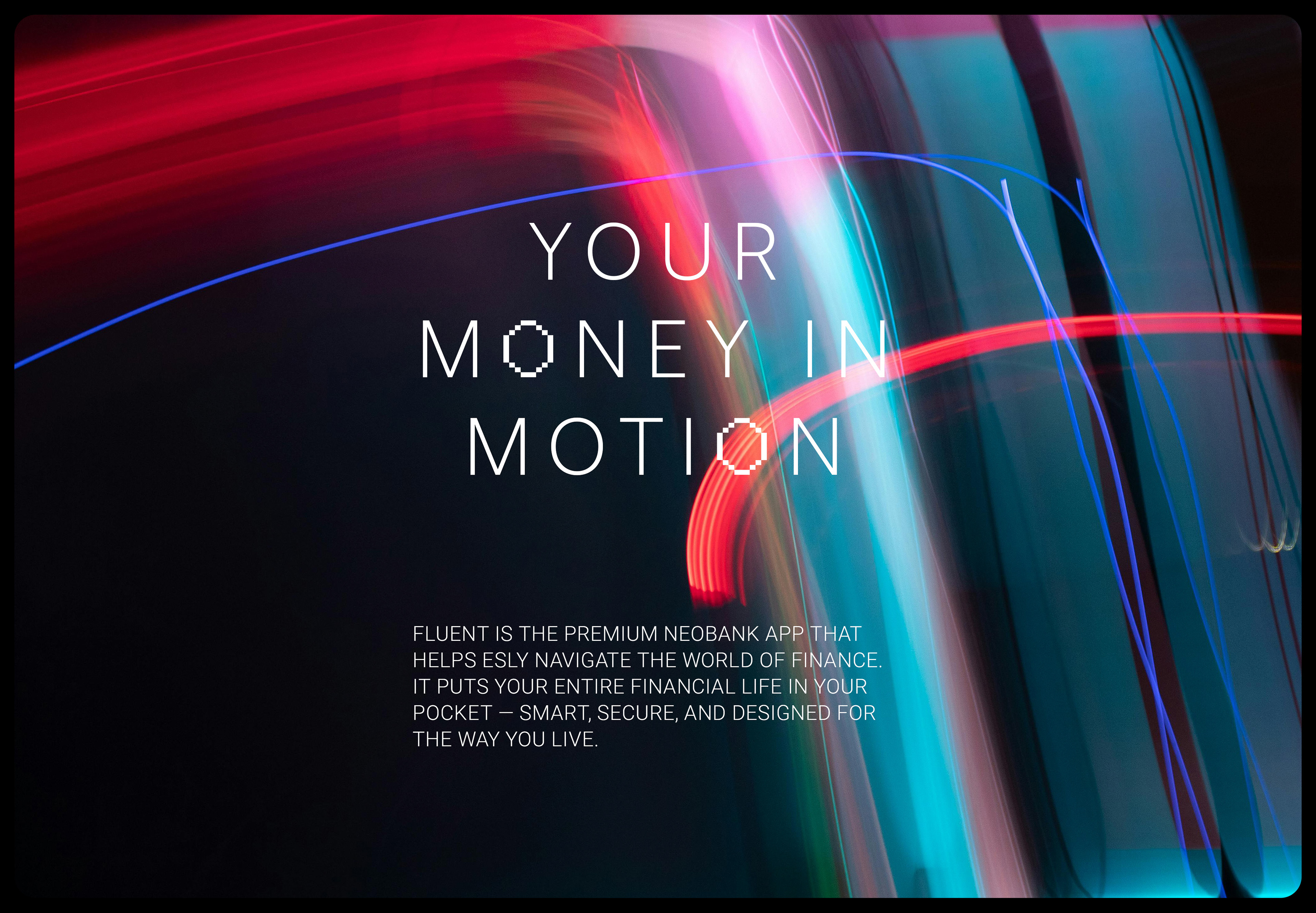
I built the brand concept and visual system around restraint — clean typography, a minimal interface structure, and a flexible color system designed to create ease without feeling sterile. Rather than treating brand and product as separate layers, I designed them together, exploring how visual hierarchy and simplified UI patterns could make financial interactions feel more intuitive, so the brand’s promise of “clarity” was something users actually experienced, not just something they read in a tagline.
I built the brand concept and visual system around restraint — clean typography, a minimal interface structure, and a flexible color system designed to create ease without feeling sterile. Rather than treating brand and product as separate layers, I designed them together, exploring how visual hierarchy and simplified UI patterns could make financial interactions feel more intuitive, so the brand’s promise of “clarity” was something users actually experienced, not just something they read in a tagline.
Execution
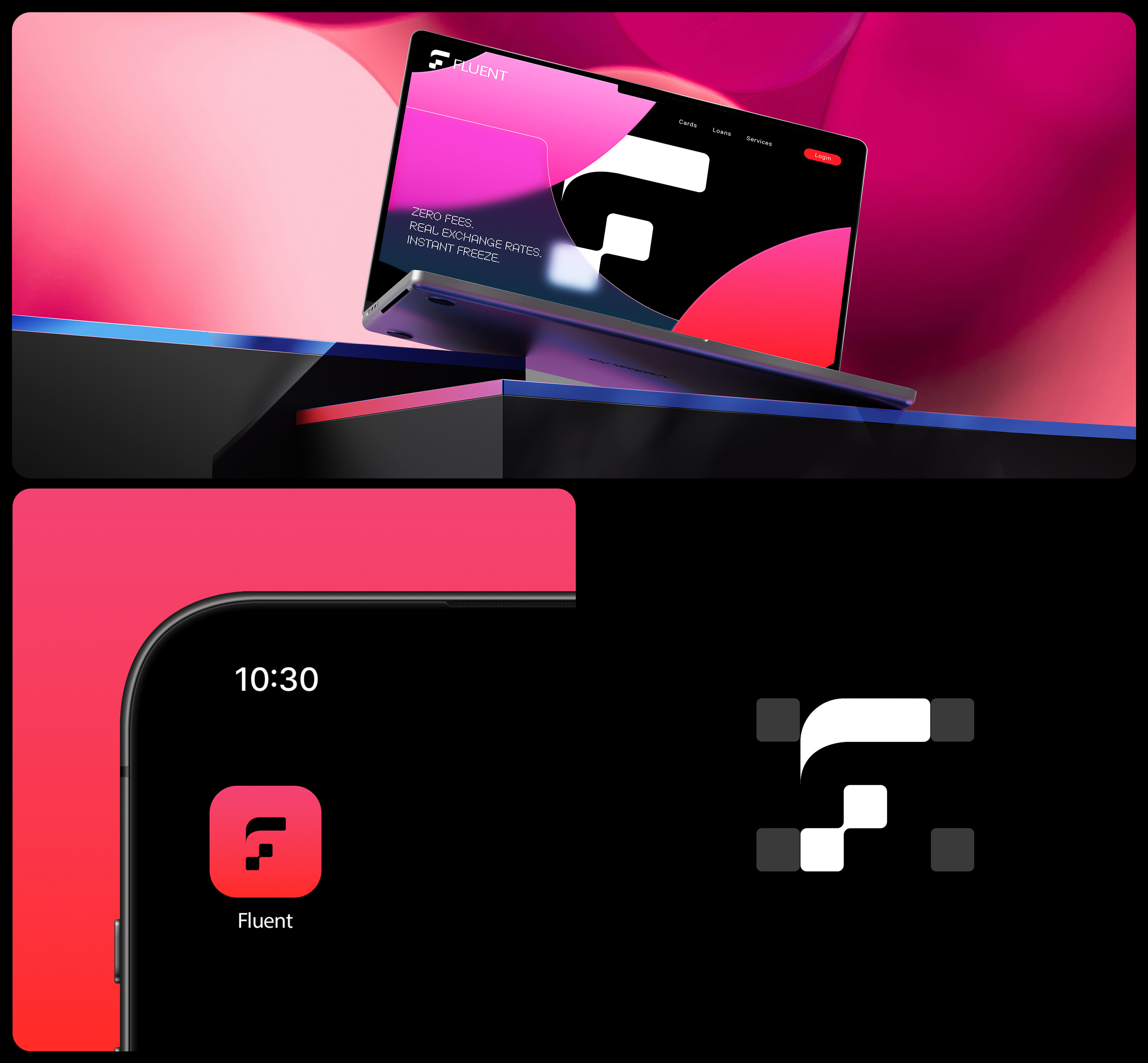
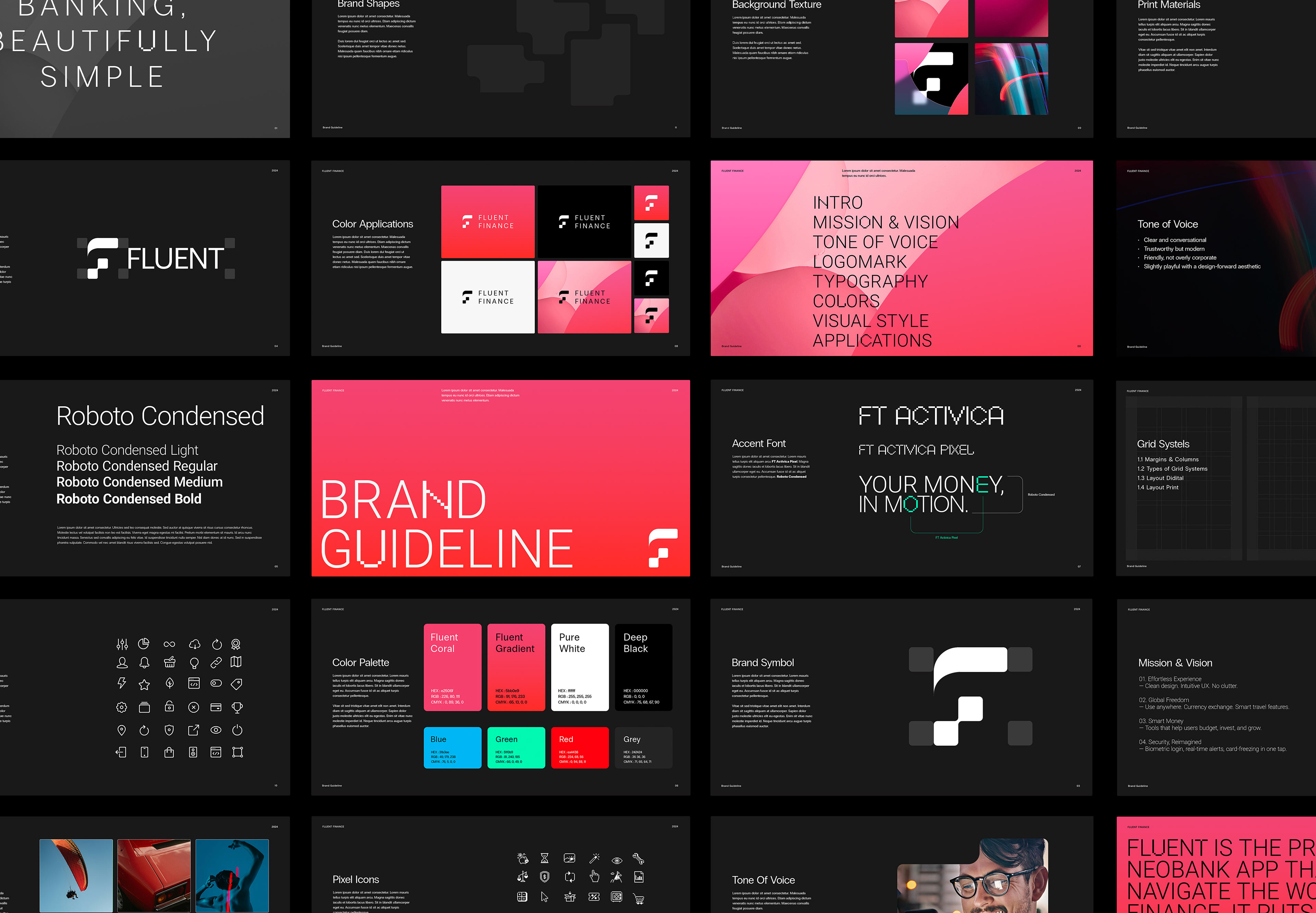
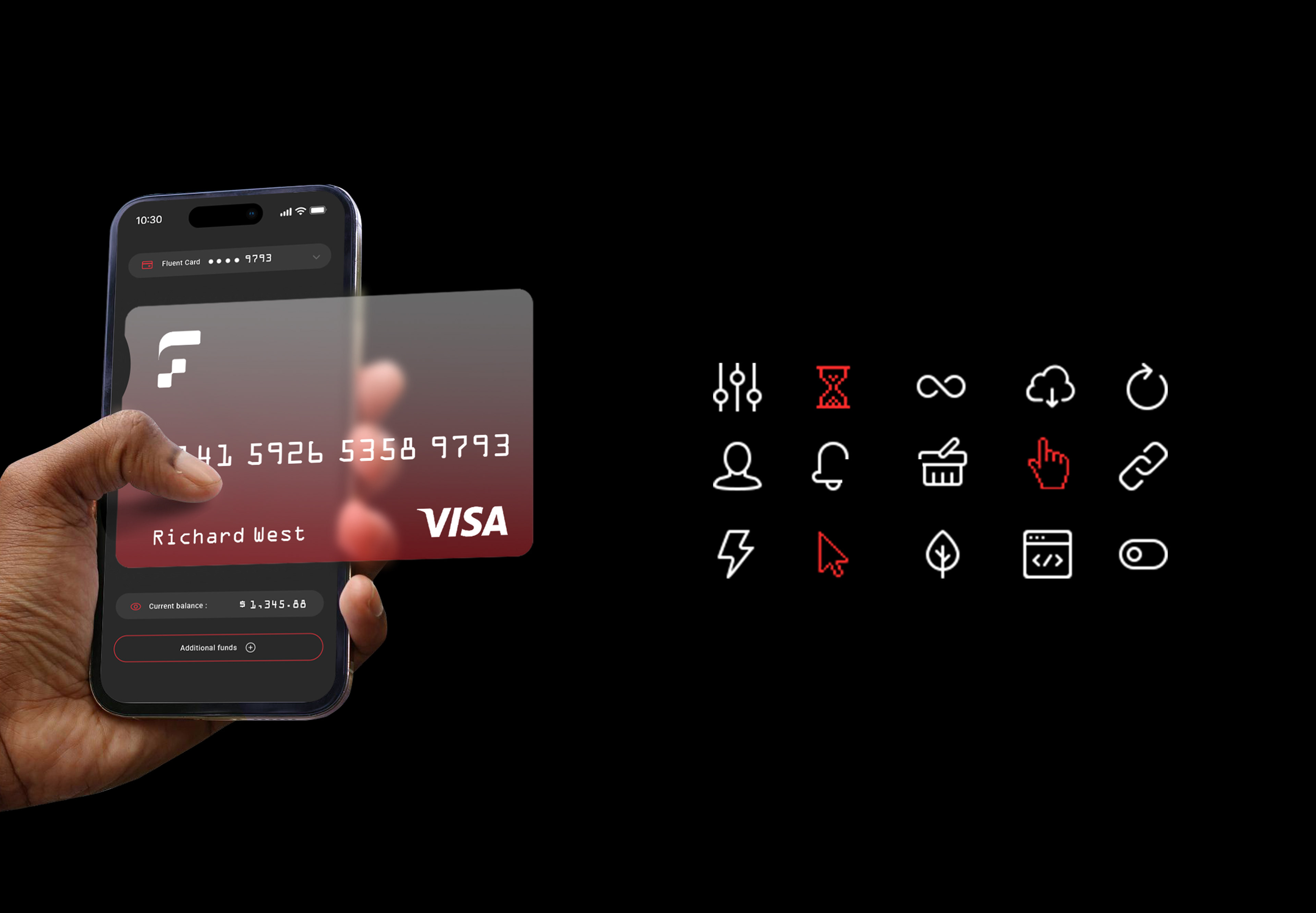
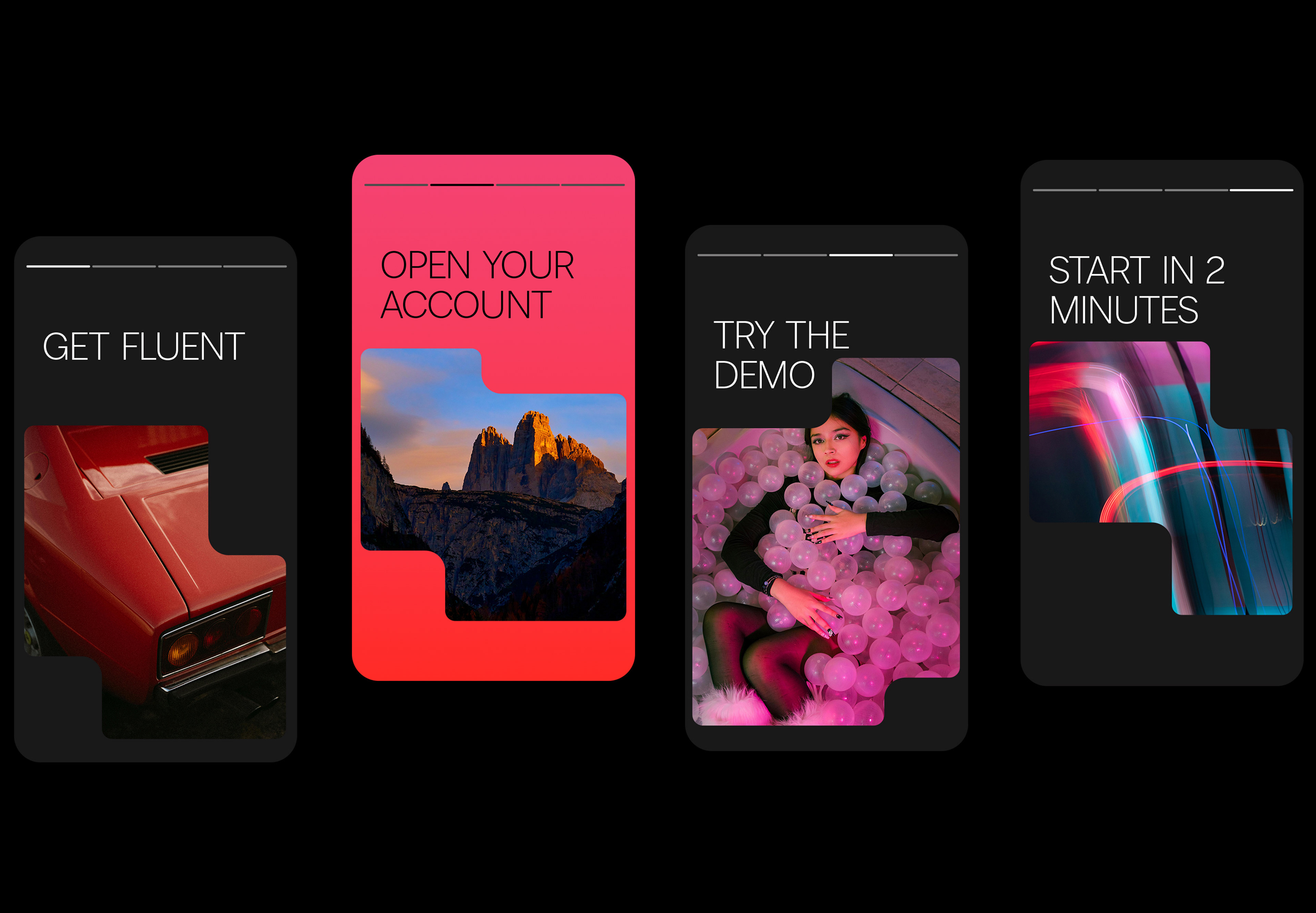
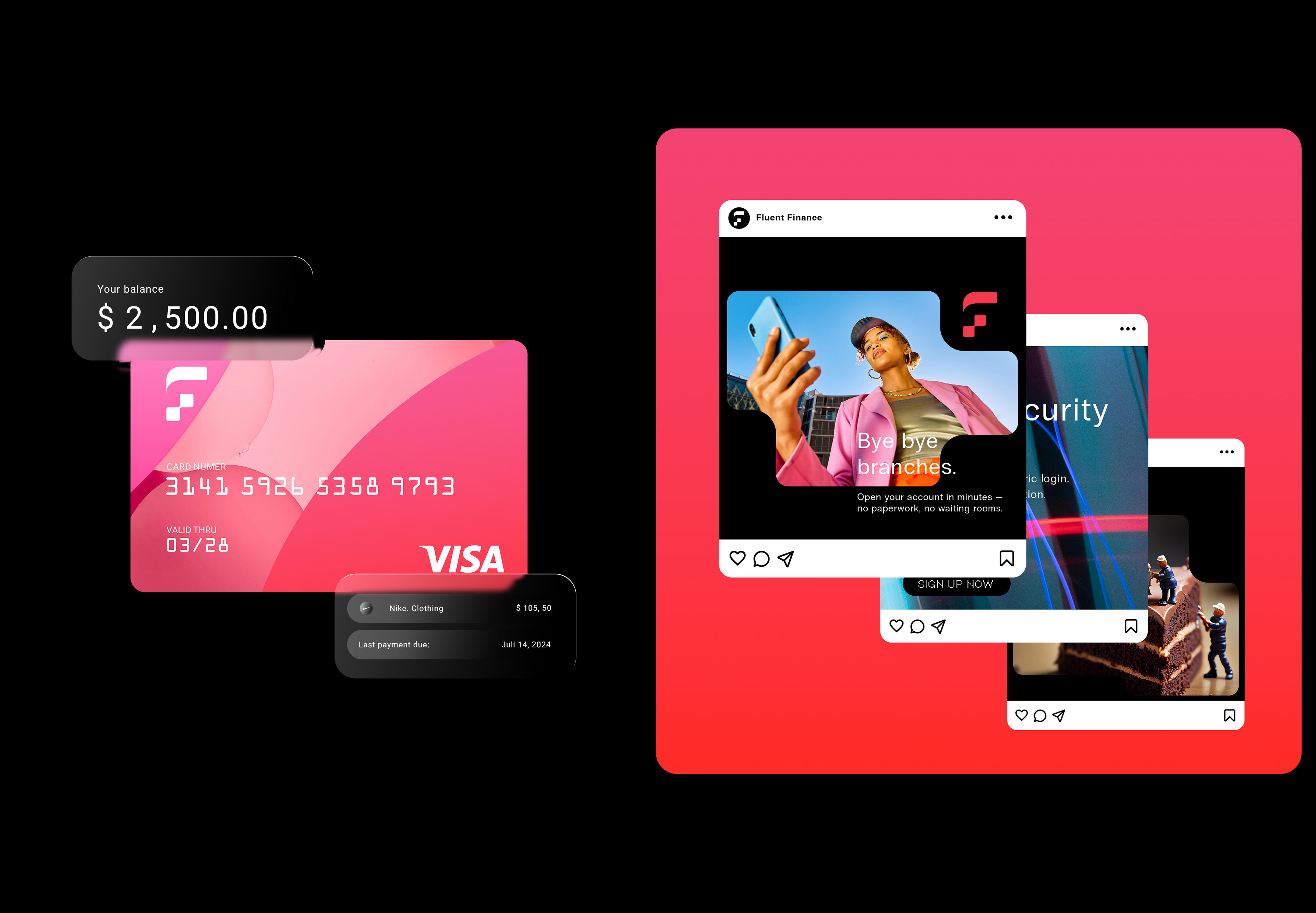
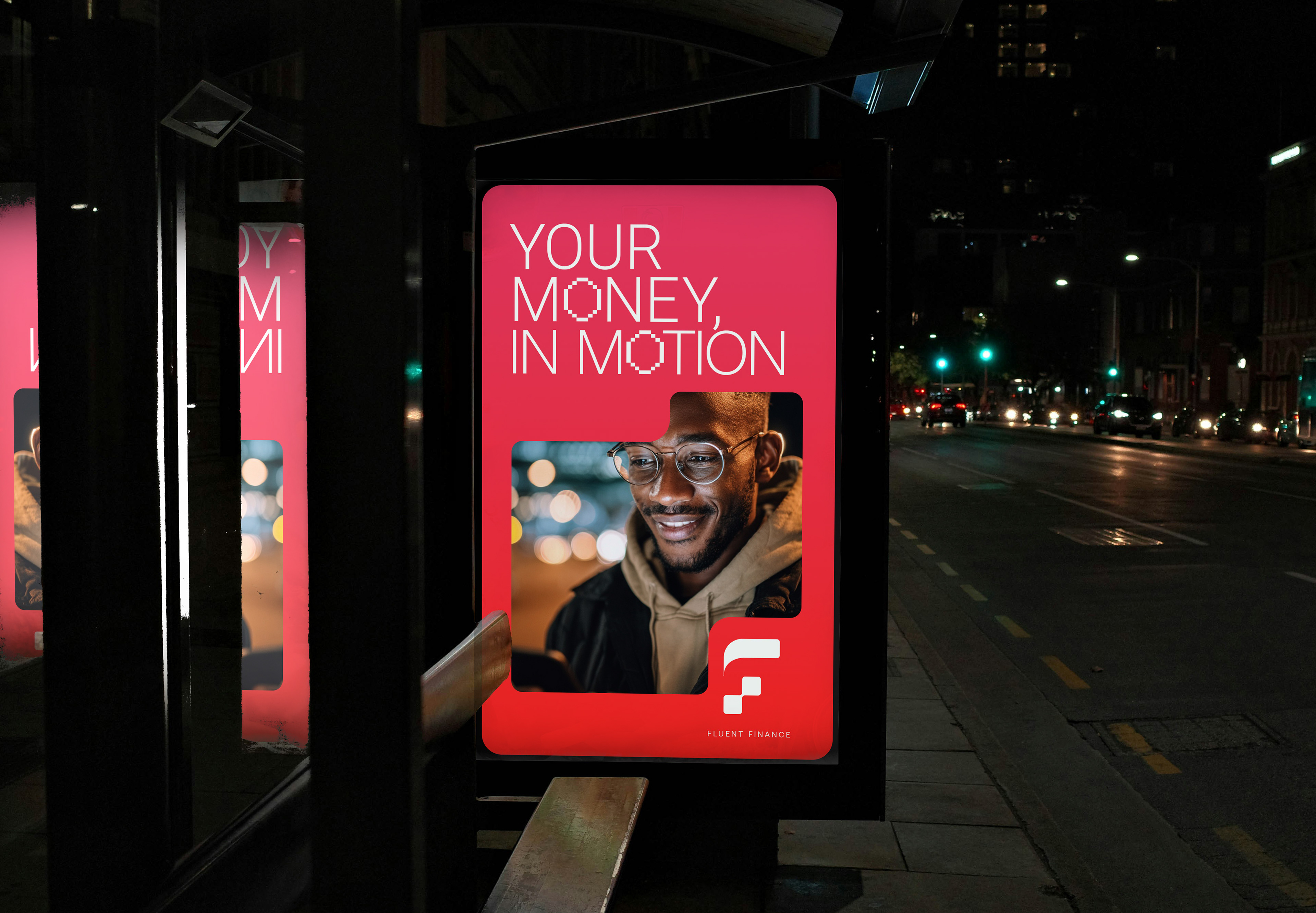
I developed the full identity system — visual language, typography, color system — and worked through how it translated directly into product touchpoints, ensuring consistency between the app interface and the broader brand perception across marketing and product experience.
I developed the full identity system — visual language, typography, color system — and worked through how it translated directly into product touchpoints, ensuring consistency between the app interface and the broader brand perception across marketing and product experience.
Outcome
The result was a cohesive brand and product direction that positions Fluent as a modern, user-centered fintech experience — balancing clarity, trust, and visual simplicity, with an identity system built to scale across digital touchpoints.
The result was a cohesive brand and product direction that positions Fluent as a modern, user-centered fintech experience — balancing clarity, trust, and visual simplicity, with an identity system built to scale across digital touchpoints.