
Role: Art Direction, Visual Strategy & UI/UX Design
Background: Douglas is more than a cosmetics retailer — it also offers a wide range of professional beauty services. The challenge was to communicate these services more effectively while creating a seamless and cohesive digital experience. Although product information was well structured, the services section felt disconnected from the rest of the platform, and inconsistencies in the user experience negatively affected usability, engagement, and conversion rates.
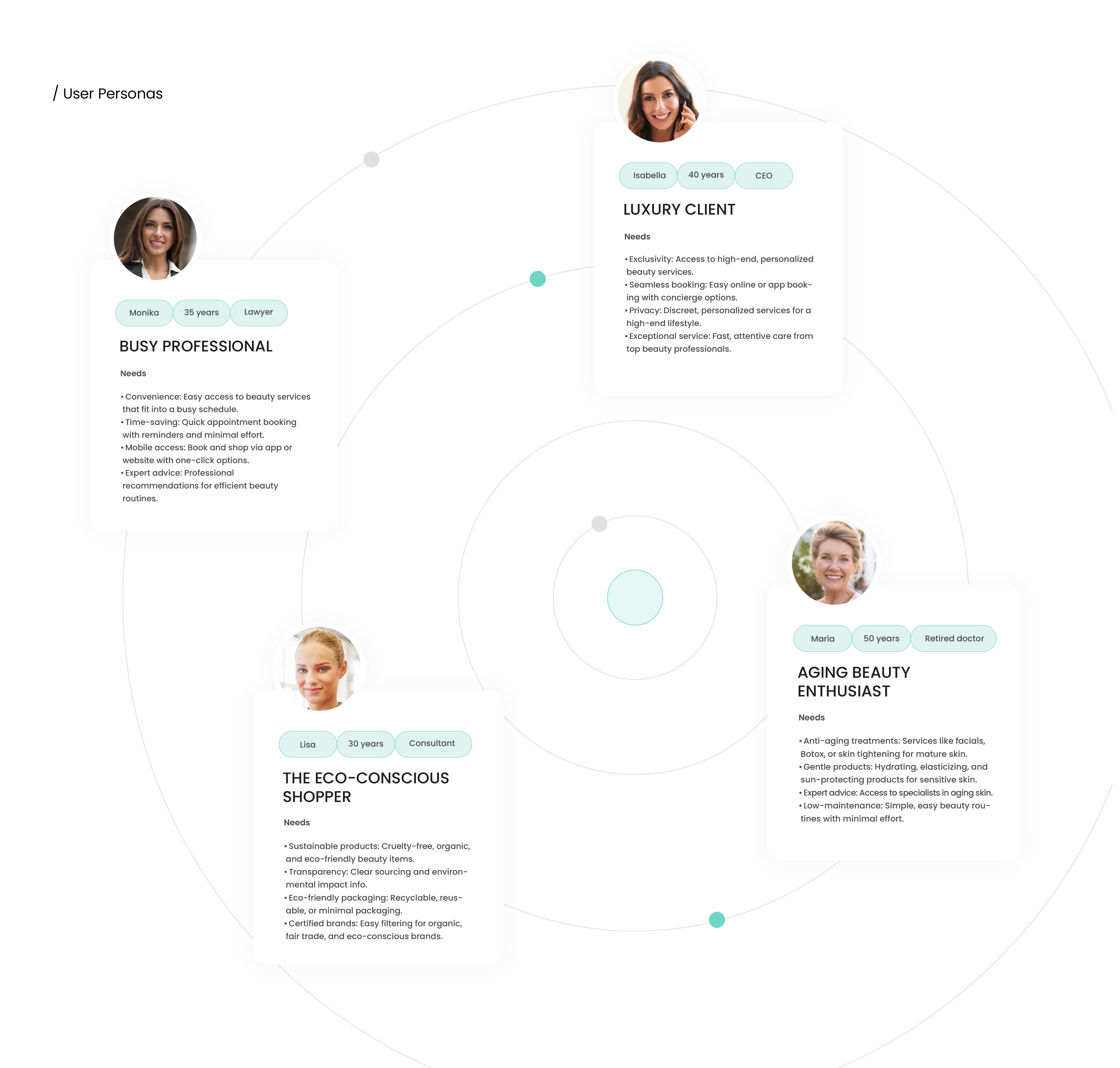
Challenge: Redesign the beauty services experience to make it more intuitive, discoverable, and visually engaging. The objective was to unify the UX across the platform, simplify navigation, and create a stronger connection between products and in-store beauty services.
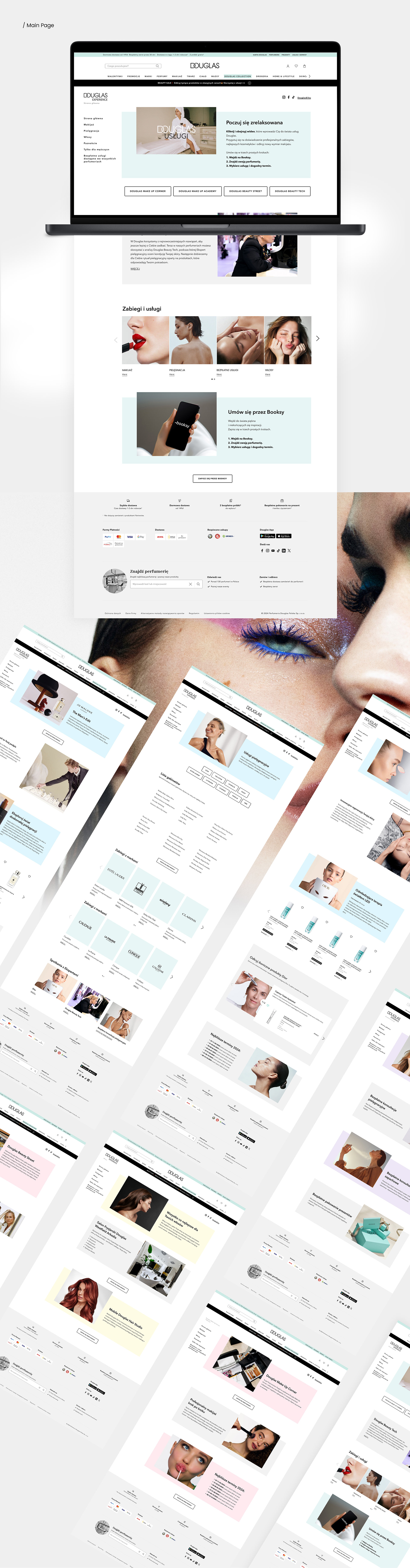
Solution: Developed a user-centered digital concept that elevated the visibility of beauty services through a refined visual language and a more consistent interface system. The project focused on improving information architecture, streamlining user flows, and designing a dedicated landing page where all services could be explored in a clear and inspiring way.
The process included:
Art direction and visual concept development
Design of a centralized beauty services landing page
Research and competitive analysis
UX strategy and customer journey mapping
Wireframing and interactive prototyping
Usability testing and iteration
Art direction and visual concept development
Design of a centralized beauty services landing page
Research and competitive analysis
UX strategy and customer journey mapping
Wireframing and interactive prototyping
Usability testing and iteration
Result: The outcome was a cohesive and engaging service experience that aligned with the overall Douglas brand ecosystem. By combining strategic UX improvements with a stronger visual identity, the new concept made beauty services easier to discover, navigate, and book — resulting in a more seamless customer journey and a stronger foundation for conversion and customer engagement.
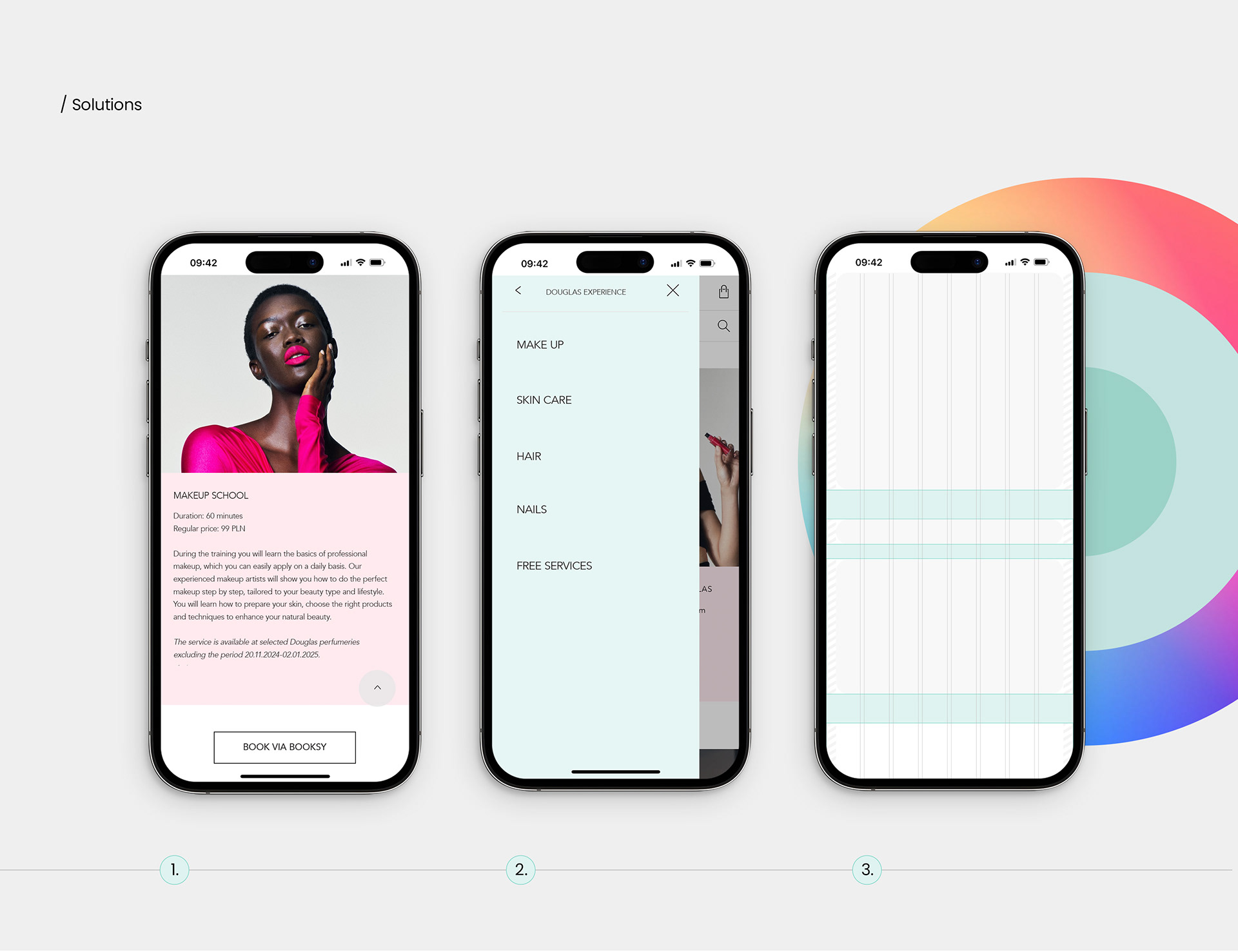
1. Professional and consistent language was used to reflect the brand’s values and maintain a unified tone.
2. The menu structure was simplified to improve navigation and make services easier to access.
3. The website design was aligned with the brand identity to create a cohesive user experience.
2. The menu structure was simplified to improve navigation and make services easier to access.
3. The website design was aligned with the brand identity to create a cohesive user experience.
The project presentation was created for non-commercial use. All materials used in the project, belong to Douglas and other owners from official websites.